A blog from the right-wing Cato Institute caught my eye. It claims, on the basis of an article published last year, that poorer households have less personal wealth in countries with higher welfare state expenditure. Apparently, this is because people in welfare states don’t need to provide for the same contingencies that others might have to. The headline claims: “Welfare State Causes Wealth Inequality”.
The original article , by Fessler and Schürz, is complex and careful, and it’s capable of being interpreted in several ways. The article is behind a paywall, so here’s a link to a slide show with key details. Wealth holding is very strongly reflects the pattern of inheritance, and the people this most affects aren’t the poorest. The authors explore a range of interpretations, most notably the apparent paradox that
social services provided by the state are substitutes for private wealth accumulation and partly explain observed differences in levels of household net wealth across European countries. … This implies that an increase in welfare state spending goes along with an increase — rather than a decrease — of observed wealth inequality.
I’m not convinced that we can treat social expenditure as a unified element – the way countries treat pensions is not necessarily how they treat people with disabilities – and if there is a generative relationship, it’s not at all clear what affects what. In my own published work, more generally, I’ve been critical of analysing country effects in this way.
The paper where I make the arguments is on open access here. What matters is not the number of data points within the countries, because those points are interdependent, but the number of policy units (that is, governments). There just aren’t enough countries to be able to do this analysis sensibly, and this paper is no exception. direction Here is a graph from Fessler and Schürz‘s paper, showing some of the key information.
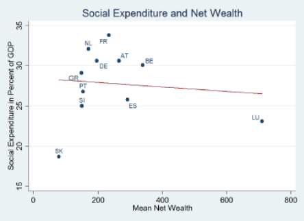 The data in the article are based on 13 countries; this graph has eleven. One of them is Luxembourg, a notorious outlier – not just because it’s small, but because it’s distinctive. Remove Luxembourg from the analysis, and the line in the graph goes clearly and strongly in the opposite direction. (That reversal of direction, which contrasts with the apparent pattern for people with less wealth, actually makes the findings more interesting.)
This doesn’t mean that the interpretation in the article is wrong. The hypothesis is intriguing and plausible, and it could still be true. The problem is that we can’t tell.