The government’s misleading figures about poverty reflect a wider problem

The Prime Minister has been upbraided by the Office for Statistical Regulation (part of the UK Statistics Authority) for his assertion that child poverty is falling, when on all the tests used by the government the opposite is true.  I’m not greatly enamoured of those tests.  I’ve considered the case for the standard test of ‘relative’ poverty, 60% of the median income, in other work – it’s not bad, but we need to accept that it’s a pointer, not an authoritative measure. The claim that the figures for 2010/11 represent a test of ‘absolute poverty’ is particularly suspect.  Having said that, however, there’s no real excuse for blustering that poverty has been getting better, when your own figures say that’s not so.

This is part of a wider problem, and one we’ve seen increasingly in the course of the last few years.  The UK Statistics Authority was formed in the hope that it would be possible to maintain confidence in the integrity of official statistics.  In the course of the last ten years, however, we’ve seen a growing contempt for statistical evidence,  shown in the treatment of figures about crime, social security claims, incapacity, the management of coronavirus and more.  It’s done whenever departments publish figures that are not official, when the press is steered to have a go at popular targets like migration or benefit fraud, and when ministers just make stuff up. There is a cost to undermining public trust: it’s not just that some figures can’t be believed, but that everything becomes open to doubt.
Child poverty measures saved! A note from Kitty Stewart

Dr Kitty Stewart prepared a joint letter about Child Poverty Statistics which was signed by 170 academics, and published in The Times.  The Times keeps the details behind a paywall, so with Kitty’s permission I am posting the letter and list of signatories here.

This is the text of the letter:

This week the House of Commons will decide whether to persist in abolishing the UK’s child poverty indicators, replacing them with ‘life chances’ measures of worklessness and educational attainment. We urge the government to listen to the Lords and retain the existing indicators, keeping income and material deprivation at the heart of child poverty measurement.

Research shows conclusively that income has a causal effect on child development: children in poor households do less well in part because of low family income. Worklessness is an inadequate proxy for children’s circumstances: two-thirds of UK children in poverty live with a working adult.

A recent government consultation showed overwhelming support for the current measures from academics, local authorities, frontline services and others. Just 1% of respondents supported removing income from poverty measurement.
Wider indicators of children’s well-being are welcome and important, but should not come at the expense of the existing poverty measures, which are vital to our ability to track the impact of economic and policy change.

Kitty has subsequently written:

The government has backed down on the abolition of the child poverty measures. The Bishop of Durham’s amendment was defeated in the Commons last week, but the government subsequently put a revised amendment to the Lords which does pretty much the same thing. There will be no requirement to report to parliament, but the law will continue to require annual publication of all four of the existing measures.

Maybe our joint letter, which was published in the Times on the morning of the Commons debate, added a little bit of extra pressure at a key moment, on top of the strength of the vote in the Lords and the concerted opposition from children’s charities and others. Whether it did or not, it seems that making a lot of noise can still make a difference, which is very cheering!


Working while on Universal Credit

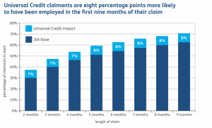
The DWP is claiming that Universal Credit is getting people back to work, and the Guardian reports:  “Research finds 71% of UC claimants move into work in first nine months of their claim compared with 63% of jobseeker’s allowance claimants”.  Well, that’s what’s reported in a glossy pamphlet, Universal Credit at Work.  Here’s the graph they use:

UC DWP version

The report that it’s based on doesn’t however say that.  The graph that the DWP has chosen to use, Figure 7 in that report, does not show that people have “moved into work”.    It shows, rather, the possibility that people will have done any work at all at any period while on benefit.  The original title of Figure 7 is:  “Impact of UC on cumulative employment rates for 8,300 new UC claims in 10 offices between July 2013 and September 2014”.   The figures for occasional hours are, unsurprisingly, more favourable for Universal Credit than for JSA, because the  system allows for that.

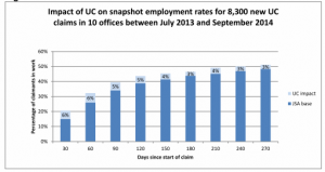
By contrast, the figures for “snapshot” employment – whether or not people are doing any work at the stated time period – are much less favourable, running 3% higher for UC claimants after 9 months.  Here’s Figure 6 from the report, which shows who was currently working from the same cohort:

UC Actual figures

The title of that figure – part of the information dropped from Universal Credit at Work – explains that this was done early on in the system (when UC was not being rolled out to areas of high pressure).


More confusion about median income

The government is proposing, not for the first time, to change the signposts that are used to warn us if child poverty is getting worse.  The most commonly used indicator in Europe, the “risk of poverty”, is based on “economic distance”, judged as 60% of the median income.  The median income splits the top half of incomes from the bottom half.  One of the objections, made by a spokeswoman for the PM, is right:  if the median income falls during a recession, the poverty threshold might also fall.  The other statement, made by David Cameron, shows he doesn’t quite get it:

“Today, because of the way it is measured, we are in the absurd situation where if we increase the state pension, child poverty actually goes up.”

That could only be true if lots of pensioners were sitting on something just below  the median income, enough to change the figure, and the government was offering a big enough increase in the pension to leap-frog them over the median.  Not that  many are.   I suspect this is probably another example of confusing the median with the average.  The mean average is sensitive to changes in income anywhere in the income distribution, top or bottom; the median, or the half-way point, isn’t.

Additional note, 2nd July:  An editorial in the Scotsman this morning writes that

“there is an element of truth in the belief that poverty cannot be wiped out. This becomes an inescapable fact if poverty is measured in relative terms: for people to be rich, someone has to be poor. … Using relative terms, poverty could be reduced if an economic crash hit the wealthiest hard and closed the gap between rich and poor by simply drawing back the rich while the poor standing still.” 

No, that wouldn’t alter the median; that’s completely wrong.  What is it about simple sums that defeat grown-ups so completely?

I wrote an article about this four years ago:  Why refer to poverty as a proportion of median income?, Journal of Poverty and Social Justice, 2012 20(2) 163-176 (sadly, behind a pay-wall).  There are problems using the median income: the biggest is that we’re comparing people on very low incomes to other people on fairly low wages, which are often unstable and insecure.    I suggested there that we could go for a comparison with median wages instead.  That doesn’t, however, address the other problem, which is that lots of our politicians and journalists can’t quite grasp what the figures are about.

HMRC make hardly any mistakes

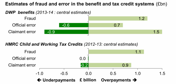
I was looking up some figures on benefit expenditure, for a paper I’m giving in a few days, when I came across this  little graph from a parliamentary briefing.

fraud and error HMRC

The figures in the bottom half  are available in an HMRC paper published last June.  According to Table 5, HMRC made mistakes in the claimant’s favour in 20,000 cases, but it didn’t cost the taxpayer anything; and they made mistakes in their favour in 30,000 cases, saving £10m or about £330 a throw. This is an remarkable record – an incredible achievement, one might say. One wonders why they even bother with official error regulations when they hardly ever get anything wrong.

Further note, October 2015:  While I was trawling through the links on the blog (an unrewarding chore) I found an updated version of the HMRC paper published in June 2015, and I have altered the link to fit the new version.  This still claims that mistakes in the claimants favour cost nothing, but the estimate of £10m in HMRC’s favour is now to be divided between 90,000 people rather than 30,000.

A report on Work Programme statistics

Two years ago, I raised questions with the UK Statistics Authority about the figures that had been released on the Work Programme.  My concerns at the time were that

  • political claims had been made for the success of the Work Programme that could not be scrutinised by outsiders
  • it was not clear what the criteria were for success, and
  • the cohort of ‘early’ service users had been selected.

The current crop of figures,  which has information to the end of 2013, is not much better.  It covers only ‘job outcome payments’,  and doesn’t include information about referral, speed of placement, or sustainment payments.  It also doesn’t refer to sanctions for non-compliance, which David Webster has noted is larger than any other outcome of the Work Programme.

The UKSA has just published its assessment of the Work Programme statistics.  They have been critical of two issues: the incomprehensibility of referring to job outcome payments, and  the misleading press releases about the programme, which they think might undermine confidence in official statistics.


Benefits cap: more dodgy statistics

On the Today programme this morning, newly appointed minister Mike Penning fulminated against a careful and thorough report by the Chartered Institute of Housing – and did so by reiterating claims that the benefits cap has encouraged 16,500 people into work.  There’s a summary on the BBC website.  The same claims, previously made by Iain Duncan Smith, have been directly condemned by the UK Statistics Authority, because they are based on figures that have not been published or subject to official scrutiny.

It’s very unlikely that they’re true, for two reasons.  The first is that it’s a normal part of social security that people who have become unemployed return to work in a short time.  The numbers cited in the CIH study as returning to work (10%) seem if anything to be lower than might be expected, but that may reflect the selection of particular groups (homeless people and single parents) for penalties.  The second is that the estimates of people affected by the benefit cap have been consistently exaggerated – first it was going to be 80,000, then 55,000, then 40,000, and even that may prove too high.  This may be a popular policy, but it’s aimed at a rare and unusual target group who when they exist do so in vanishingly small numbers.

Additional note, 9th December:  40,000 is too high.  The latest figure on the cap is that 28,500 have been affected.

Sexual orientation in the Scottish Household Survey

The Scottish Household Survey offers an accessible, varied picture of Scottish life.  It has lots to say for example about participation in cultural activities and ‘sport’ (which it confuses with intentional physical exercise – walking and dancing count as sports).

The Times‘s main comment was about sport of a different kind. They latched onto a particular table, which seemed to them underestimate the numbers of gay, lesbian and transsexual people.   “Asked about sexuality, 98 per cent of respondents defined themselves as ‘heterosexual/straight’ with only 1 per cent saying they were gay, lesbian, or bisexual.” Despite what the newspaper supposes, that’s reasonably consistent with a series of other findings from similar surveys.

This was one of the Scottish Government’s ‘core questions’.  The doubts of the LGBT groups focus on the low numbers of people specifically identifying themselves as gay. The problem seems to me to lie not in mis-reporting, but in the focus on ‘orientation’ rather than what people actually do. Is no-one out there celibate? Isn’t there anyone who’s just not very interested? In a society where nearly 40% of households are headed by single adults, it seems that people are being asked to classify themselves in terms of relationships they don’t actually have. This is a very strange way to define someone’s identity.

Some more benefit stats on longer-term claims

Having been sucked in to the DWP page hosting ‘ad hoc analyses’, I’ve also been looking at an April paper on long-term benefit receipt. It’s very unusual for people who are unemployed to be continuously on benefit for long periods, but some people are frequent claimants, moving into and out of work – it’s an intrinsic part of the ‘flexible labour markets’ that the government is so keen to encourage. The presentation of the figures is confusing – all “out of work” benefits are lumped together and specific benefits are represented as percentages of percentages.

What the paper seems to show, however, is first that the numbers of people who have been claiming for at least three years of the last four is fairly static – 2.47 million in 2010, 2.51 million in 2012.

Second, most of the people who are on benefits for three out of four years are incapable of work, and it is not reasonable to expect them to. (That isn’t me saying so; it’s the specification in the statute.) That accounts for 1.7 million of the 2.5 million.

Third, the proportions of people who are unemployed seem to be growing – but this probably says more about the operation of the benefit system than it does about the client group. People are being increasingly defined as falling in a new sub-category of benefits, consisting of JSA, Income Support for Lone Parents and people with incapacities in the work-related activity group – evidently the people who the government wants to target for a return to work. That category has grown from 698,000 people in 2010 to 1,008,000 in 2012 – an increase of over 44% in two years.